

Data visualization is the graphical representation of information. In this guide we will study what is Data visualization and its importance with use cases.
Understanding Data Visualization
Data visualization translates complex data sets into visual formats that are easier for the human brain to understand. This can include a variety of visual tools such as:
- Charts: Bar charts, line charts, pie charts, etc.
- Graphs: Scatter plots, histograms, etc.
- Maps: Geographic maps, heat maps, etc.
- Dashboards: Interactive platforms that combine multiple visualizations.
The primary goal of data visualization is to make data more accessible and easier to interpret allow users to identify patterns, trends, and outliers quickly. This is particularly important in big data where the large volume of information can be confusing without effective visualization techniques.
Why is Data Visualization Important?
Let’s take an example. Suppose you compile data of the company’s profits from 2013 to 2023 and create a line chart. It would be very easy to see the line going constantly up with a drop in just 2018. So you can observe in a second that the company has had continuous profits in all the years except a loss in 2018.
It would not be that easy to get this information so fast from a data table. This is just one demonstration of the usefulness of data visualization. Let’s see some more reasons why visualization of data is so important.
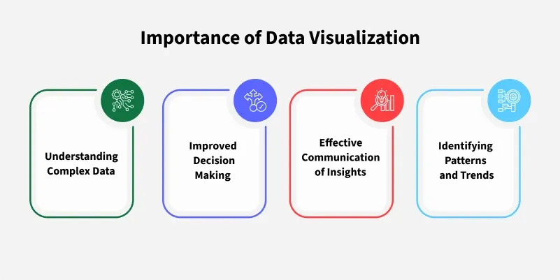
1. Data Visualization Simplifies the Complex Data
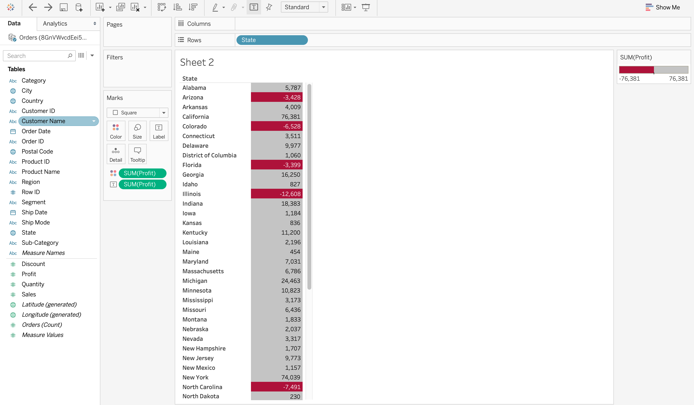
Large and complex data sets can be challenging to understand. Data visualization helps break down complex information into simpler, visual formats making it easier for the audience to grasp. For example in a scenario where sales data is visualized using a heat map on Tableau states that have suffered a net loss are colored red. This visual makes it instantly obvious which states are underperforming.
2. Enhances Data Interpretation
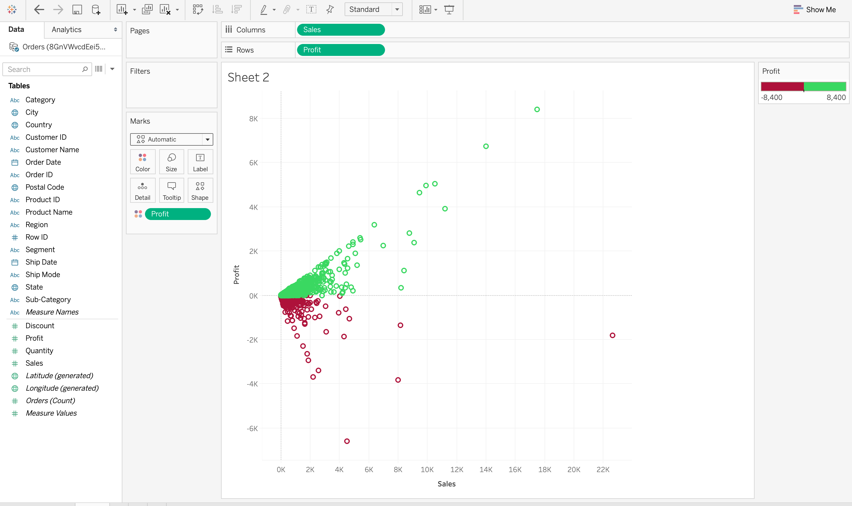
Visualization highlights patterns, trends, and correlations in data that might be missed in raw data form. This enhanced interpretation helps in making informed decisions. Consider another Tableau visualization that demonstrates the relationship between sales and profit. It might show that higher sales do not necessarily equate to higher profits this trend that could be difficult to find from raw data alone. This perspective helps businesses adjust strategies to focus on profitability rather than just sales volume.
3. Data Visualization Saves Time
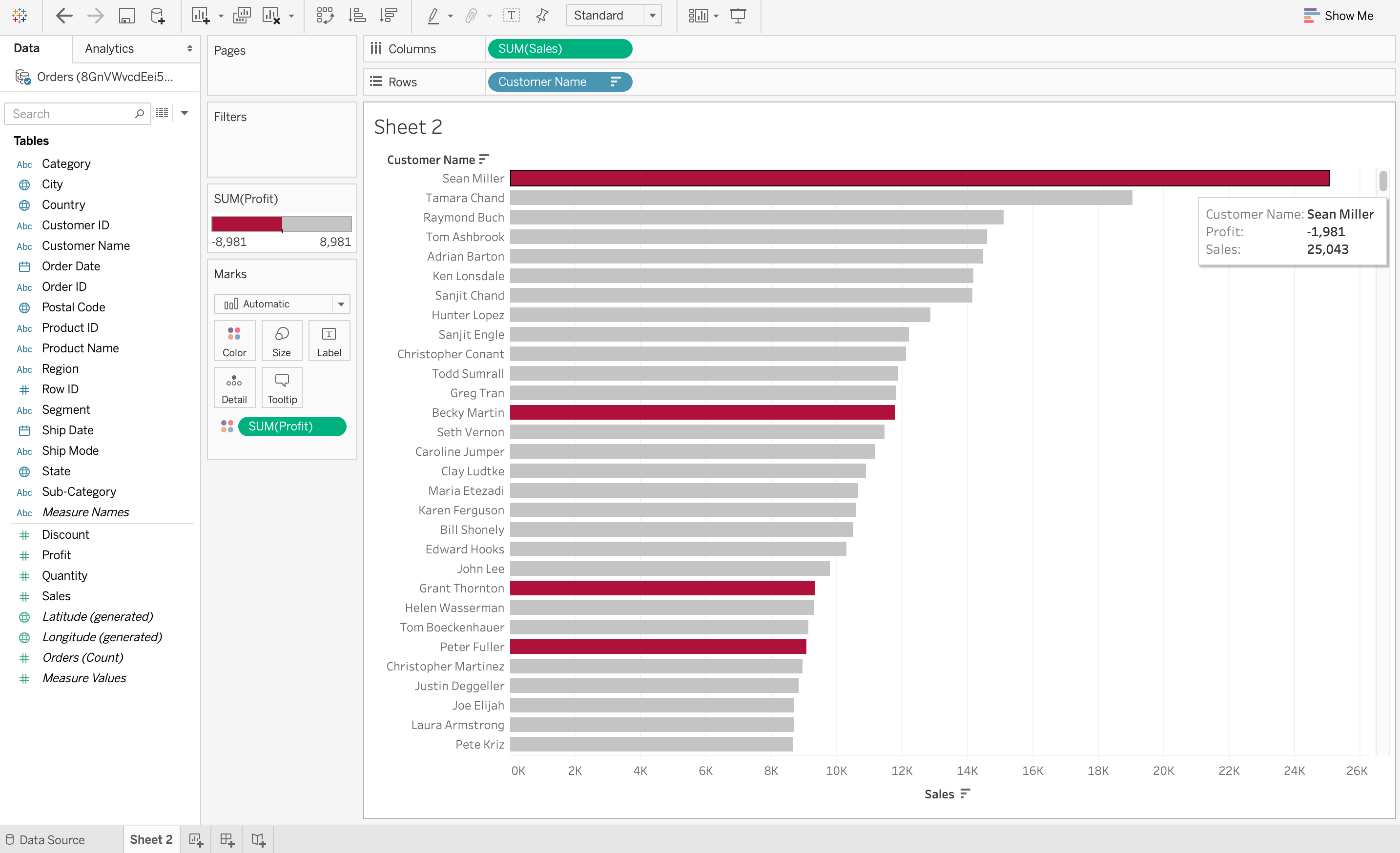
It is definitely faster to gather some insights from the data using data visualization rather than just studying a chart. In the screenshot below on Tableau it is very easy to identify the states that have suffered a net loss rather than a profit. This is because all the cells with a loss are coloured red using a heat map, so it is obvious states have suffered a loss. Compare this to a normal table where you would need to check each cell to see if it has a negative value to determine a loss. Visualizing Data can save a lot of time in this situation.
4. Improves Communication
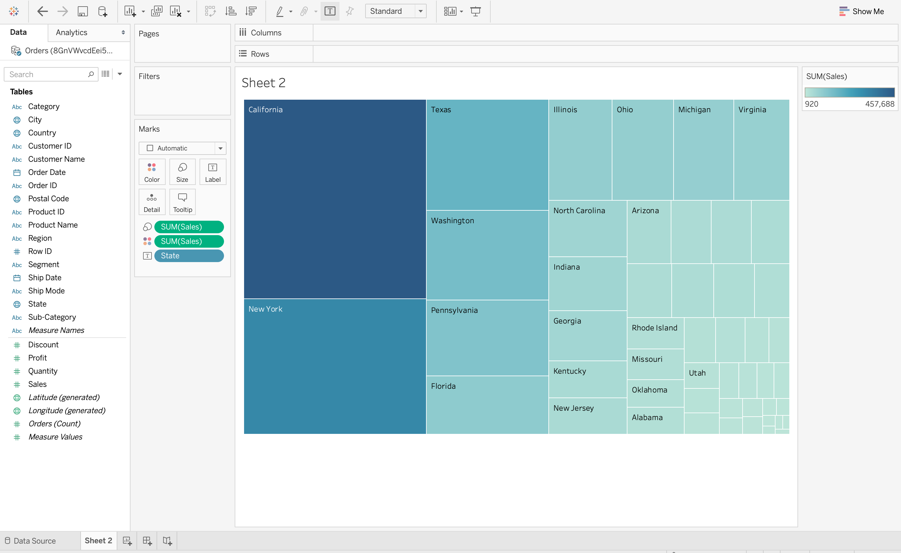
Visual representations of data make it easier to share findings with others especially those who may not have a technical background. This is important in business where stakeholders need to understand data-driven insights quickly. Let see the below TreeMap visualization on Tableau showing the number of sales in each region of the United States with the largest rectangle representing California due to its high sales volume. This visual context is much easier to grasp rather than detailed table of numbers.
5. Data Visualization Tells a Data Story
Data visualization is also a medium to tell a data story to the viewers. The visualization can be used to present the data facts in an easy-to-understand form while telling a story and leading the viewers to an inevitable conclusion. This data story should have a good beginning, a basic plot, and an ending that it is leading towards. For example, if a data analyst has to craft a data visualization for company executives detailing the profits of various products then the data story can start with the profits and losses of multiple products and move on to recommendations on how to tackle the losses.


0 Comments